
news
The Document Foundation has its own visual identity
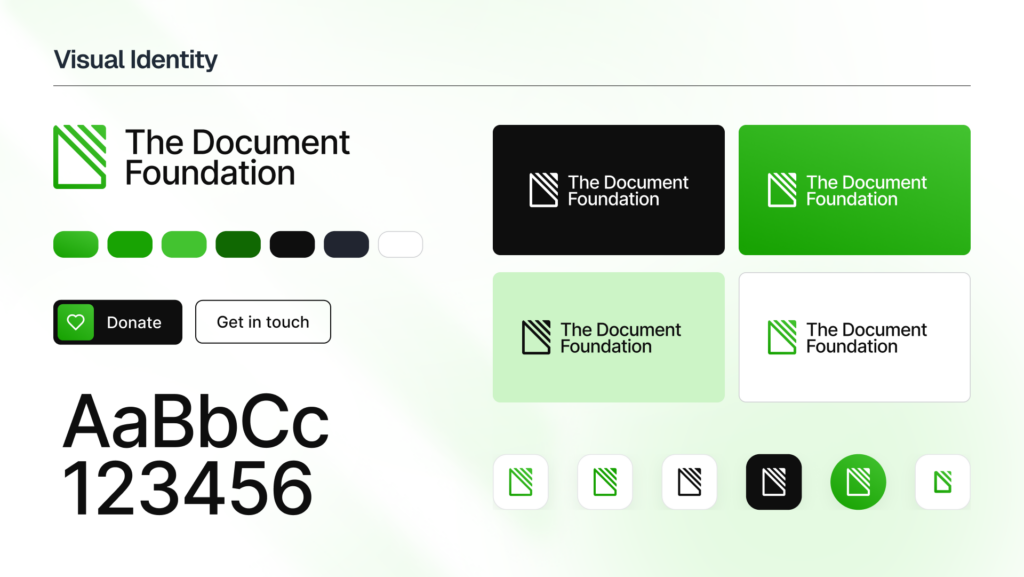
Quoting: The Document Foundation has its own visual identity - TDF Community Blog —
Since its founding in 2010, The Document Foundation has used the LibreOffice logo to represent itself. This was a deliberate choice: a young project needed to concentrate recognition on a single name and a single mark, and LibreOffice was the name people needed to know.
Sixteen years later, the foundation’s work extends well beyond the product. TDF takes part in the development of the Open Document Format (ODF) standard, contributes to policy discussions on interoperability and digital sovereignty, and works with public administrations, standards bodies and other open source organisations. In these contexts, the foundation speaks as an institution, not as a software project, and it needs a signature of its own.
OMG Ubuntu:
-
The Document Foundation gets its own logo after 16 years - OMG! Ubuntu
The change means that, for the first time since its inception in 2010, TDF no longer shares the same logotype and wordmark as LibreOffice.
“The Document Foundation” is now the sole wordmark, written in a different font, Inter, and a refreshed set of brand colours complement it.
Unveiling the design, TDF’s Italo Vignoli made the case for a decoupling of the two brands, noting “the foundation speaks as an institution, not as a software project” whose work “extends well beyond the product” that it’s known for, i.e. LibreOffice.