New Nitrux Not Up to UI Standards
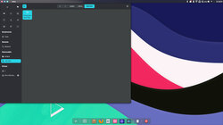
Overall, the NX desktop suffers from an identity crisis. It is confusing to use mainly because its KDE appearance is a shell with incomplete functionality. Easy things lack any straightforward navigational tools.
I found Nitrux to be very unappealing. The developers could remove some of this bad user experience by providing a demo video or some on-screen quick-start details to provide initial orientation,
The identity crisis does not subside quickly. It takes too much time to guess and discover otherwise hidden user functions. Experienced Linux users might keep playing around with Nitrux.
I doubt newcomers will overcome the UI barriers, and I do not see this KDE retread called the NX desktop offering much for seasoned users who are used to high-end power features to get through their daily workload.

