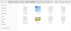
Gnome Files: A detailed UI examination
A great amount of my writing on this site revolves around complaining about modern user interface design. Some people agree with me, some don't. Most probably don't care at all. That's fine. What I find interesting is that many (but not all!) people who disagree either present extremely specific non-argument nitpicks like "Something in Windows 3.1 was bad, too!" and ignores the big questions posed, such as whether it's actually a good idea shoving everything into a single hamburger menu, or if mixing touch and desktop paradigms wildly between and sometimes within programs is actually beneficial to end users. Others - despite my efforts to the contrary - use sweeping dismissals of the kind "you just don't like flat design." That's true - I don't like flat design, but many of my arguments have nothing whatsoever to do with aesthetics.
Well, that's what writing on the net is like. But I shall not despair, nor shall I be silenced! Allow me, for a few moments, to focus on a very detailed example that's got nothing to do with flatness, but rather with how to access core program functionality.
It's worth mentioning that I agree that the modern design paradigm probably is friendly to beginner users in many ways. But at some point, people stop being beginners. People who use computers several hours per day, performing a wide variety of tasks in many different programs, should also be taken in to account when designing software. As such, my critique comes from the point of what's usually called a "power user". It's also worth considering that the more an interface hides, the less it offers by way of opportunities for a user to grow and learn.

