
news
Planet KDE: About time…
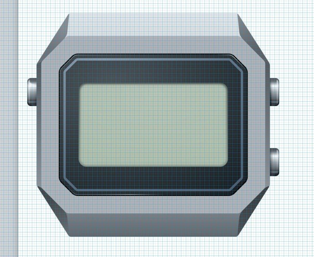
Quoting: About time… – Nuno-Icons —
So I started with a very basic shape, mostly trying to get the proportions right, and from there it slowly became more and more of a actual object. The side buttons appeared, the LCD got some depth, the case became more angular, and I spent a frankly unreasonable amount of time trying to make the brushed steel look like brushed steel.
Then came the fun part… all the little useless details.
The light and alarm symbols, the not days of the week but rather running timers 😉 , the branding and of course the very prestigious "kool desktop environment 2026" written across the top. Absolutely essential information at 64 pixels 🙂
The last bit was adding the gear/play element so it reads as KTimer and not simply as the KASIO 😉 watch I apparently wanted when I was 12.
And thats pretty much how these things happen… start with a rectangle, add a few details, remove some, add way too many again, move things around for far too long and eventually decide its an icon.
A k Time well spent… probably. 😀